Explore this article
Inspired by the Dulux Colour Forecast 2027, Steve Cordony shares his advice for creating a cohesive whole-home colour palette, from choosing your foundation and undertones to layering colour, texture and finishing touches.
Jump to Section
The colour palette you choose for your home does more than set the backdrop.
It can influence how each space feels, help create a sense of flow and bring personality into the way you live. For interior and lifestyle designer and Boutique Homes ambassador Steve Cordony, colour is one of the most powerful tools for shaping the mood of a home. Also a Dulux ambassador, Steve draws inspiration from the Dulux Colour Forecast 2027, where expressive colour, richer tones and nature-inspired shades are set to influence interiors in the year ahead. Here, Steve shares his advice for building a colour palette that works across your whole home, from finding your starting point to creating a cohesive story from room to room.Colour sets the mood
For Steve, colour is one of the first considerations when designing a space because it can immediately shape the way a room feels. Whether you want your home to feel calm, warm and enveloping, rich and moody, or light and playful, your colour palette can help establish that atmosphere from the beginning. Steve often takes inspiration from travel and nature, translating the colours, textures and materials he sees into a broader interior palette. A natural landscape, for example, might inspire warm greys drawn from stone, paired with greens influenced by moss, foliage or the surrounding environment. Starting with a feeling or visual reference can give your palette a clear direction and help guide the rest of your selections.
Know what you’re going for
Before choosing individual colours, think about the overall style you want to create, as well as the architecture and setting of your home. A coastal-inspired interior might naturally lean towards soft whites, gentle greys, muted blues and sage greens. A more contemporary or dramatic home could lend itself to deeper colours such as charcoal, burgundy, rust or earthy reds.
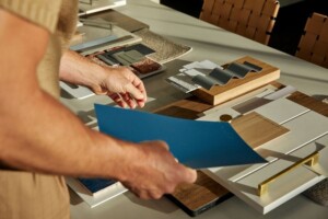
While there is always room to be bold, Steve recommends keeping the broader palette relatively streamlined.
A neutral or tonal foundation across larger elements such as walls, flooring and furniture can give you greater freedom to introduce colour through smaller features. Artwork, lighting, soft furnishings and decorative pieces can then become opportunities to build personality around that foundation without overwhelming the space.
Colour trends are becoming more expressive
One of the strongest themes shaping interiors for 2027 is a greater focus on feeling and emotion. The Dulux Colour Forecast 2027 explores this through three key themes: Sensory Play and Treasure. Play is centred around optimism and joy, bringing together soft pastels, calming blues, spearmint greens and brighter accents of orange and berry. Treasure takes a richer and more expressive approach, with deep blues, crimson and berry tones creating a jewel-like quality. Sensory draws from nature, using warm neutrals, earthy browns and softer blues to create spaces that feel grounding and restorative. Rather than following a trend exactly, Steve suggests looking at the colours that resonate with you and finding ways to incorporate them into the broader story of your home.
Keep things cohesive
A whole-home palette doesn’t mean using exactly the same colours in every room. Instead, Steve recommends creating a thread that carries from one space to the next. If your overall palette is neutral, for example, you might introduce different accents throughout the home while keeping their undertones or intensity consistent. A colour used in artwork in one room might appear again through cushions, lighting or decorative pieces elsewhere. This repetition helps spaces feel connected without making them feel overly coordinated.
Pay attention to tone and warmth
The undertone of a colour can have a significant impact on how it works alongside the rest of your interior. Warm whites, cooler greys, earthy neutrals and blue-based shades can all respond differently to flooring, cabinetry, stone, tiles and natural light. Steve recommends considering warmth, tone and intensity across the entire palette rather than selecting colours individually. Subtle tonal changes can add depth, while balancing warmer and cooler shades can help create a more layered and resolved interior.
Finish the colour story through styling
Once the main palette is in place, styling is where you can bring in another layer of personality. Artwork, cushions, rugs, throws, lighting and decorative objects can introduce colour in a more flexible way, allowing your home to evolve over time. This is also where you can be more playful. A stronger accent colour might appear through an artwork or statement piece, while softer variations can be repeated in textiles and accessories throughout the room. The key is to keep referencing the broader colour story so each addition feels intentional.
Create a palette that feels like you
Across the Boutique Homes Portfolio and Edition ranges, customers can explore a curated selection of colours, materials and finishes designed to work together throughout the home. In the Boutique Homes Abode Inspiration Studio, our dedicated team of Interior Designers will guide you through each selection, from fixtures and fittings to paint colours and appliances. They’ll work with you to bring each element together, creating a cohesive home that reflects your style and brings your vision to life. Whether you’re drawn to calming neutrals, earthy shades, playful colour or deeper and more dramatic tones, a considered colour palette can help bring your whole home together.
Explore the Portfolio and Edition ranges and discover the possibilities for your new home.